Choosing the right font for your design projects can make all the difference. To start, consider your audience. The typography you choose will communicate emotions and feelings to them. For example, a design project for a kids’ summer camp should look playful, bright, friendly, and colorful. On the other hand, a business card for an accounting firm should be professional, important, and strong. Keep your audience in mind when selecting your font and ensure it plays into the style and emotion of the design.
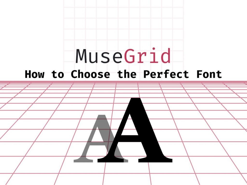
Understanding the 2 Types of Fonts
There are two categories of fonts: Serif fonts and Sans Serif fonts. Serif fonts have small “teeth” or nubs, while Sans-Serif fonts are smoother and have no edges or teeth. Some examples of Serif fonts are Times New Roman, Georgia, while some examples of Sans-Serif fonts are Ariel, Helvetica, Lato, etc.

When choosing a font for a design, brainstorm the qualities and characteristics you want the design to communicate. This will help you match up the right font with the right mood or personality. For example, Serif fonts suggest tradition, history, reliability, and safety, while Sans Serif fonts are more modern, contemporary, and clean. Script fonts can add a sense of femininity, romance, grace, and elegance. Make sure the font you choose resonates with the design and your intended audience. You’re going to need to figure out what the font says about itself and whether it fits in with your design.
Consider Function and Form
Someone once said that typography is akin to fashion or furniture: with some functional exceptions. However, this is far from the truth. We don’t just use two or three fonts for every design; every font has a personality and a unique voice. When designing, it is essential to consider what purpose the font serves. Will it draw attention or merely supply information in detail?
When choosing a font for your designs, always consider its function and form. Make sure it is legible, as it needs to be readable for the purpose of the typography. If it is merely there for artistic purposes, legibility may not be a factor. Also, consider pairing fonts – this is a great skill to have and can be used in many situations. For example, when creating a poster with a large heading and body of text, it is important to consider how the fonts will look together.
Pairing Fonts Together
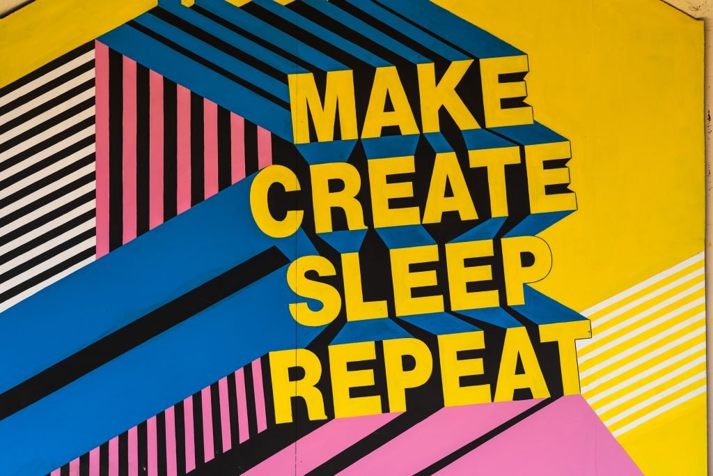
Pairing fonts with a contrast between bold and light creates visual harmony on headings and subheadings. A surefire way to achieve this look is to pair a serif font with a sans-serif font. For example, use a sans-serif font for the heading and a serif font for the main body of text to create a unified look. Another great way to pair fonts is to use two from the same family. This ensures the fonts are designed by the same person or foundry and work well together.
The header is in Helvetica Sans-Serif font, while the text below it is in Times New Roman Serif font. To make the text visually appealing, different typefaces can be utilized to create contrast and differentiation. This can be achieved through various ways such as size, weight, spacing, style, and color. The topic of contrast in foreground versus background images was discussed in a previous session and the same principles apply to fonts.
Additional Ways To Create Contrast
By using font weight, font color, and font style, designers can create an additional layer of contrast in their designs. The use of these elements, in combination with spacing, creates contrast and engages the reader.
Font Weight
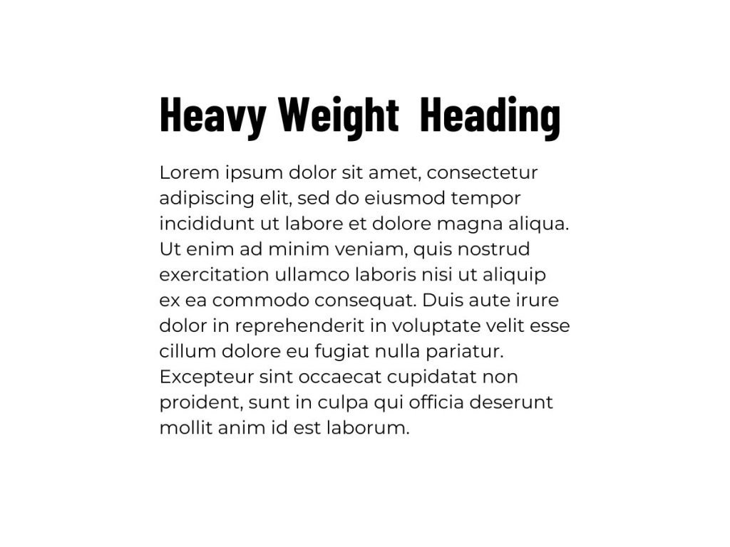
Now there’s a font weight, it has a bold feel. The word “design” is lighter, using different weights to distinguish contrast between title and one word versus rest of title. Another way is font sizes, the header is larger font, achieving contrast.
Font Color
Colors can engage readers and emphasize elements. The header has the same font as the word “design,” but the latter is lighter and has a different color that attracts the eye. Spacing is important in design, creating contrast between the header and body text through white space.
Font Style
With style, you aim for a modern look using sans-serif typefaces. You use different elements, such as color and spacing, to engage the reader and create contrast. Consis
tency is important in font pairing, even when using different typefaces.
Additional Tips For Working With Fonts
- Avoid using multiple different fonts with each other – stick to using two or three fonts. For example, use one font for the header and one font for the body text to create a contrast. Different fonts can also emulate different moods, so use three or four fonts to create the desired mood.
- Pair Images with fonts We want to pick two fonts that flow nicely together. The neutral font should go with any type of font, while the script font gives the design a unique touch. When choosing fonts, we should also consider the content that goes with it. For example, if the content is about farm fresh grapes, it would make sense to use an organic font that correlates with the image.
- The content, font and image all contribute to the design of a project. For example, take the phrase “Good morning”. The font, when paired with the image in the background, creates a certain context. This same idea can be applied to both text and images. To demonstrate, let’s do an example together. We have a background that is slightly blurred.
- Select a high-quality background that is in line with our design. The text should be clear and easy to read. The image we select for the background should be relevant to the content of the text. This will help us find our brand’s visual voice.
- We are using the space wisely by taking the font and content and placing them in a smaller area. This creates openness and a focal point. To visually separate the text from the background, we use a dark shape with white text and transparency. To attract attention, we find our brand’s visual voice, which is a focal point.
- Reduce the size of the other text and set it to all caps to draw attention. Then, reduce the font size and padding from the left side. Utilize a script font for the header to create a balanced, clean, and easy-to-read typeface set.
Wrapping it All Up
The choice of font for a design project is crucial as it conveys emotions and feelings to the audience. The right font should be chosen based on the qualities and characteristics that match the mood and personality of the design, taking into consideration the audience. There are two categories of fonts, Serif and Sans Serif, with various font styles and weights that can be used to create contrast and differentiation. It’s important to consider the function and form of the font, making sure it’s legible and readable. Pairing fonts with a contrast between bold and light creates visual harmony, and pairing two fonts from the same family is a great way to ensure a unified look. To make the text visually appealing, consider using different typefaces and color, spacing, style, and size. A tip to follow is to avoid using multiple fonts and instead stick to two or three fonts that flow nicely together. The content, font, and image all contribute to the design, so choose fonts that correlate with the image.